Data visualization work
Rain in the Netherlands
During the past weeks, it rained a lot. Sometimes even cats and dogs. I was curious: how often does it rain in the Netherlands, and if it does, how much?
I could figure that out using public data from the Royal Netherlands Meteorological Institute. I looked at my closest weather station, which is in Voorschoten.
The data showed that almost half of the days in a year, it did not rain (or almost didn’t). I looked at the period between the summer of 2024 and the summer of 2025. On 27 days it did rain a lot: over 10 mm in a day.
So in conclusion, that umbrella in the picture? We can often leave it at home.
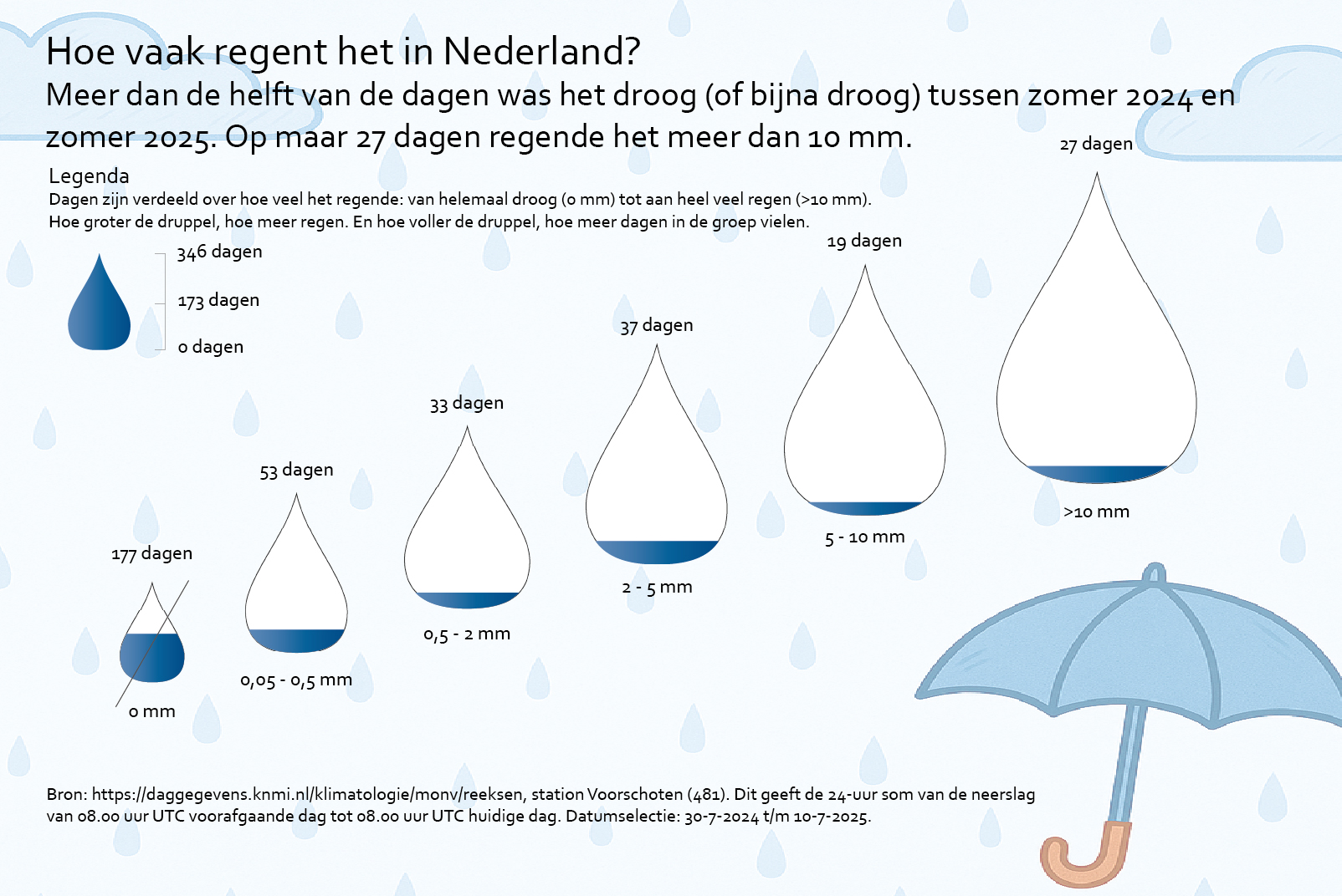
P.S. Unfortunately I had not paid attention during the day selection. The final two weeks of the summer of 2025 were not in the data yet. Therefore, I based my analysis on 346 instead of 366 days. Oops! But since perfect is the enemy of good, I am posting this anyway.
Dataviz: gas prices
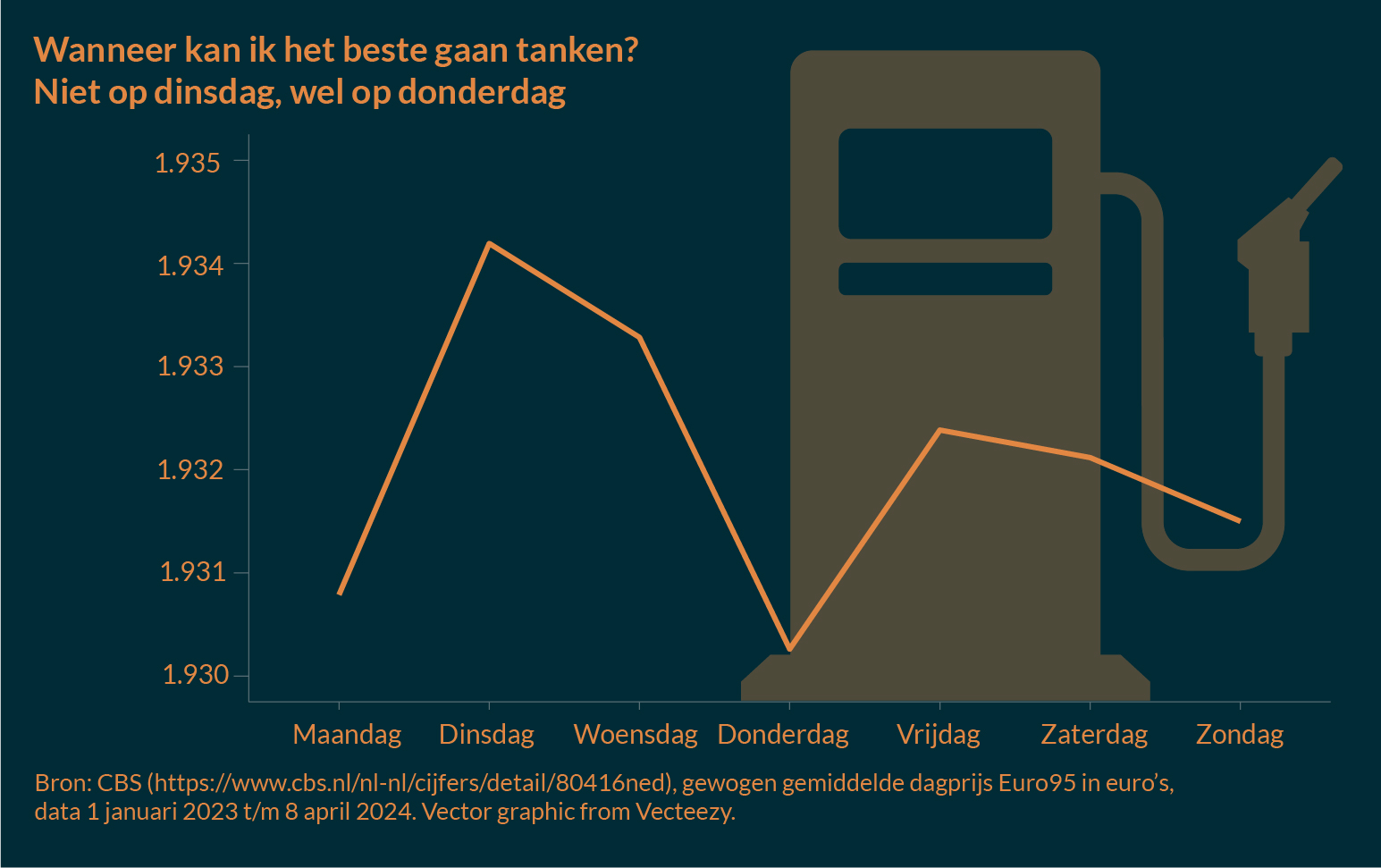
I was at the gas station, paying a lot of money for gas. Luckily I only need gas, like, once every three or four weeks. But it made me think: on which day of the week are gas prices lowest and at which are they highest? Articles online said it’d be most expensive on Mondays and cheapest on the weekends, like this one or this one.
However, Statistics Netherlands also publishes the price per day, even from 2006 onwards. So I downloaded the data for Euro 95 gas (which I use) and averaged the price per weekday. I saw a different pattern than the articles online write about. My chart is only for 2023 and 2024 (up to April, when I started working on this). It shows prices are lowest on Thursdays, with Mondays actually having the second to lowest prices. Tuesday has the highest average prize. The pattern also holds true for the entire period for which data are available (from 2006).
It does make me think: what am I missing here? Statistics Netherlands used weighted day prizes, they say in their definition. Maybe nighttime hours affect the data? It’s not a very satisfying answer, though.
I do know that from now on, I’m only going to fuel up on Mondays, Thursday and the weekends. And of course leave the car on its parking spot and try to use a bike whenever I can.
Makeover Monday: New Year’s Resolutions
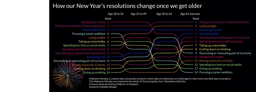
The New Year is the time of year to make resolutions to improve ourselves (or our lives). My own resolution was to make more time for doing data visualizations. Therefore, it seemed fitting to take part in this specific Makeover Monday. This is a weekly visualization project that challenges you to re-do an existing data visualization.
I tweaked the data from percentages to ranks and plotted them by age group in a bump chart. How do our New Year’s resolutions change once we get older? It seems that ‘saving more money’ becomes less important. At the same time, for older people ‘cutting down on drinking’ is a more common resolution than for the 18 to 24 year olds.
I made the chart in ggplot2 using the color palette of a photo of fireworks. I also made some final adjustments in Adobe Illustrator.
Source: Makeover Monday
Firework photo: Anthony Roberts on Unsplash
Dataviz for my children
I felt like doing a few personal dataviz projects. And what’s more personal than creating things for your own children? That is why I worked on posters for both my daughter Sofia and son Thomas. The backgrounds are both based on the very first clothes they wore. I looked up data on how common their names are in the Netherlands with data from the Meertens Institute and the Sociale Verzekeringsbank.
For my children, I’ve added their dates of birth and some more details. For their privacy, I altered the posters somewhat for display on this website.
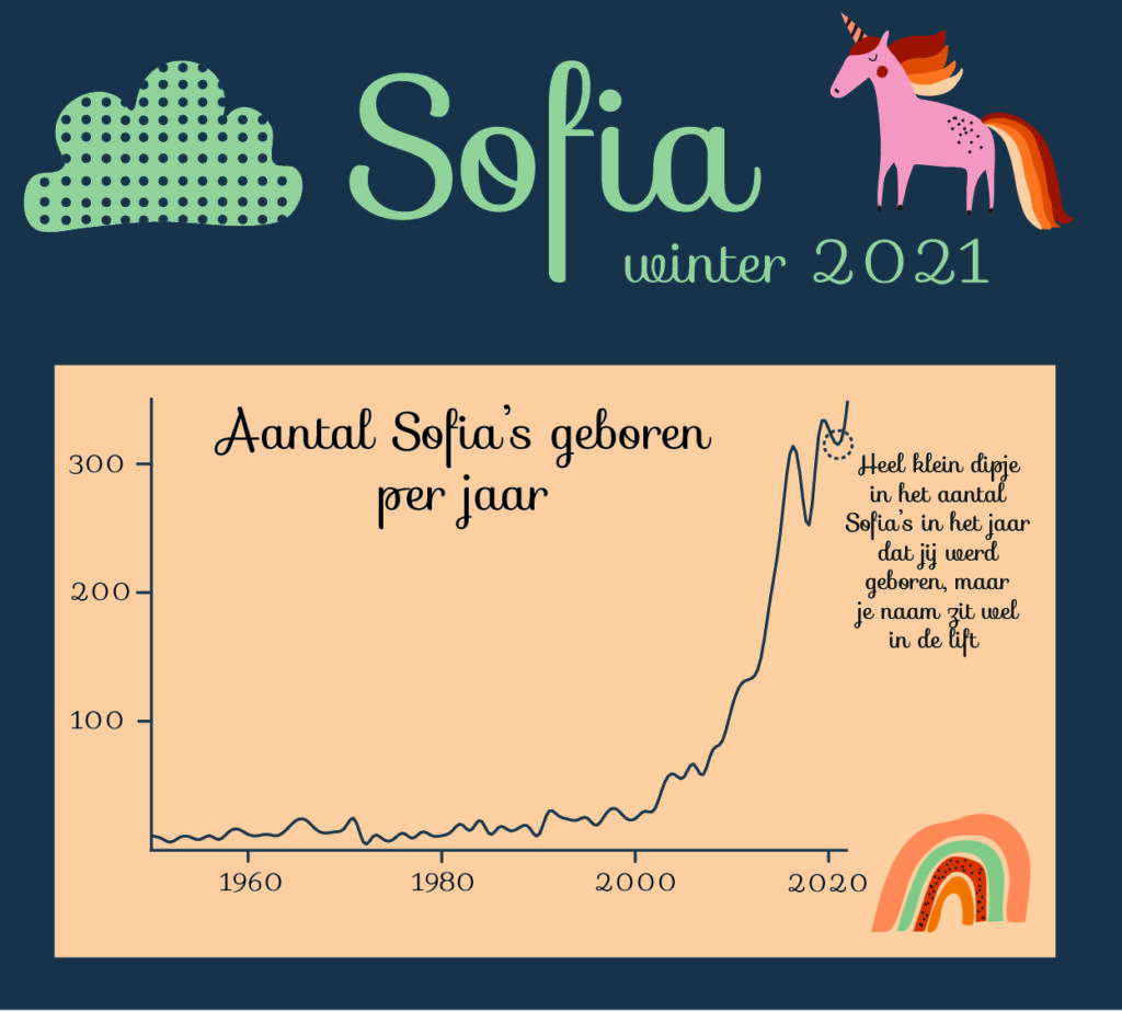
I designed this visualization for my daughter Sofia, who was born in the coldest part of the winter of 2021. I looked up how many Sofias have been born each year in the Netherlands. Turns out we were part of a trend by naming her Sofia (instead of Sofie, which is more usual in the Netherlands).
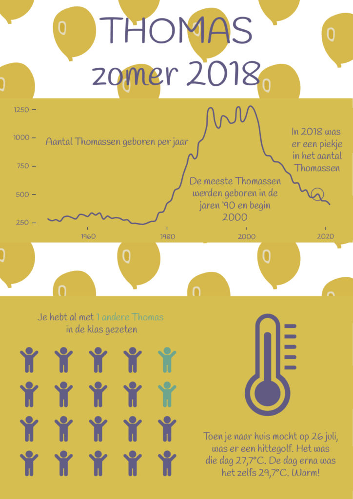
I designed this poster for my son Thomas, who was born during a heatwave in the Netherlands in the summer of 2018. Thomas has been a very popular name anyway, but we were also part of a small surge by naming him Thomas.
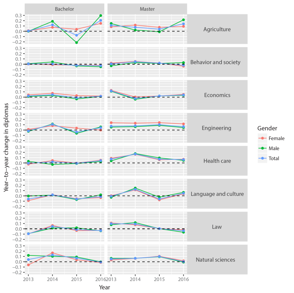
Flourish story: University diplomas in the Netherlands
As part of Alberto Cairo’s Data Visualization for Storytelling and Discovery course, I created a Flourish story on trends in university diplomas in the Netherlands. I did this using open data from Dutch Ministry of Education, Culture and Science.
Pages: 1 2